
Top Ten Tuesday is a weekly meme hosted by That Artsy Reader Girl. Go check her website out!
Hey! This week we talk about our favorite/most hated cover redesigns. Now, I’m not much for hating, especially if people have worked hard on something, which I’m assuming people do while working on covers. So instead of listing five and five, I’ll be listing six cover changes I loved and four I think shouldn’t have happened.
Some I like
Shatter Me by Tahereh Mafi

I think this is a popular one, but the improvement is so obvious. The first cover reminds me of a cornier version of The Selection, while the new covers are original and inspiring. I’m glad they redesigned this cover before the other books came out because, rest assured, if I ever buy these books in physical, it will be mainly (if not only) for the covers.
The Shadow and Bone Trilogy – Leigh Bardugo


I did not hate the first covers, though I really prefer the new ones. The design is easier on the eyes, more relaxing to look at. Also, blue is my favorite color and I love how the different shades interact with each other.
Vicious – V.E. Schwab
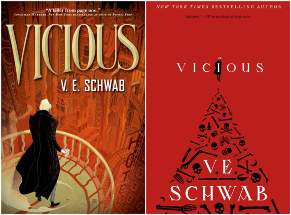
The first time I heard about this book I was having trouble picking it up because the cover didn’t appeal to me at all. I just don’t feel I’m looking at Victor when I see that cover. I’m so glad the redesign happened. To me, the second cover portrays the story much more accurately.
Mortal Instruments by Cassandra Claire
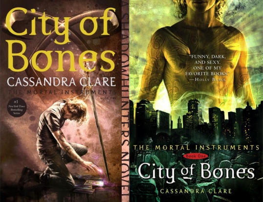
One of the best cover redesigns of all time. I mean, the first ones were just so bad. So, so bad. I am willing to bet there’s no one who prefers the original covers. If you do let me know why.
The Strange Fascinations of Noah Hypnotik by David Arnold


I hate fluorescent colors, they make me dizzy and I just can’t appreciate them. So yeah, I much prefer the redesign for this cover.
Royals (Prince Charming) – Rachel Hawkins


I don’t know why they thought it was necessary to change the title as well, but I know the first cover doesn’t make me want to pick up the book. I know the amount of pink is pretty much the same, but the second one hurts your eyes lot less in my opinions. I like the font and the drawings better too.
Some I don’t Like
The Night Circus – Erin Morgenstern

There are several editions of this book, but this one is probably the one I like the least. It feels unorganized and cluttered. It’s not the worst I’ve ever seen, but I prefer the other one.
The Winner’s Trilogy – Marie Rutkoski


It isn’t much that I hate the new covers, I just don’t get why they needed to be changed. I think if you are going to redesign a cover, you might want to make a drastic change (or don’t make one at all). I haven’t read this trilogy yet, but people tell me the new covers don’t portrait the main character’s personality correctly either. So, why the cover change? (a question that needs to be answered for all these cases.)
The Diviners – Libba Bray


Each redesign (there were a couple) is worse than the previous one. They already had a perfectly good-looking cover, why was this change necessary?
Little Monsters – Kara Thomas

Why did this change need to happen? I think the original cover was so original and pretty already. The new one is simple and seems like something I’ve seen millions of times before.
So there it is. Ten cover redesigns. Do you agree with me? Which are your favorite/most hated cover redesigns? Feel free to post your TTT links in the comments!

The Shatter Me one might be the best redesign ever lol. SO much better.
Not a fan of the Little Monsters change either.
LikeLike
The Diviners cover changes were on my Hate It list. I wished they’d kept the original. And The Winner’s trilogy changes were not the best either. I actually prefer Kestrel in the gowns.
LikeLike
I like the redesign for Vicious, too.
Here is our Top Ten Tuesday.
LikeLike
I hadn’t realized that The Strange Fascination of Noah Hypnotic had a cover change – the new one is way better. Winner’s Curse almost made my list too.
LikeLike
The Winner’s Trilogy. Oh, boy! That was such a tense time in the book community. WHY??!! Sometimes I just shake my head. lol
LikeLiked by 1 person
Yes I am happy they redesigned the Shatter Me cover. I know the Diviners had a perfect cover and all the new ones look horrid.
My TTT https://thereadingrebel.wordpress.com/2019/08/06/top-ten-tuesday-book-cover-redesigns-you-loved-or-hated/
LikeLike
That Shatter Me cover has been on so many lists this week. It’s gorgeous.
My TTT.
LikeLike
The Diviners is a really popular pick this week. I definitely think there should have been better redesigns.
LikeLike
I definitely agree with you on the Shadowhunter’s books. Most of the first covers weren’t that good (although there are a couple I like, like The Shadowhunter’s Codex). The Winner’s Trilogy has been on a lot of lists this week.
LikeLike
I love the Shatter Me covers too (even though I still have to read this series!) And I so agree about The Winner’s Trilogy. It’s one of my favourite series but the new covers really don’t suite the story. I feel they portray the main character as an assassin-thief-warrior type when she’s none of this at all.
LikeLike
Agreed with so many of these! I don’t mind the original cover for City of Bones but I like it least of all the prints that I have (I adore the UK prints that are minimal and have those vivid colours to them) and can get a little cringey if I bring it in public. I think I’m more tolerant towards it because it was the first edition of it I owned and read so I have a soft spot towards it? That being said, YES to the rest of these. I love the blue in Shadow and Bone’s newer print as well. AND, I get really annoyed when I think about the redesign for The Winner’s Trilogy and The Diviners. Yuck.
LikeLike
I especially agree about the Shatter Me, Mortal Instruments, Vicious and Winner’s trilogy covers!
LikeLike